The ultimate guide to Flexbox
Align items?? Flex-wrap? Flex-items?? Let's learn more about it!
Table of contents
As a developer you're meant to feel frustrated over CSS at one time or another, but you don't have to be my friend! Here's the ultimate -yea, and I'm not saying that lightly!- guide to CSS Flexbox. So, let's begin!
What is Flexbox?
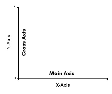
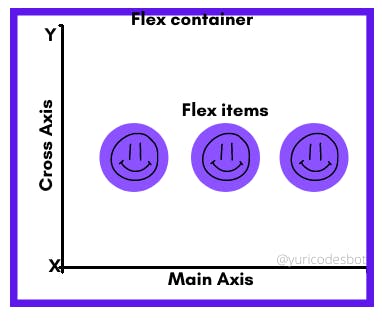
Flexbox is The Flexible Box Layout Module and it helps us make flexible and responsive layouts easier. It will organize content based on the main axis or cross axis; a visual way to remember this is to think of it as a graphic where X(main axis) and Y(cross axis). But, don't worry too much about this; it'll depend on more properties we'll see in a bit.
Also this is not a visual representation, just an easier way to remember the main axis and cross axis.

What you should know before diving in
Flexbox utilizes both a flex container and flex items; this also gives us different properties we can use on each one.
- Flex container is just your basic regular ol' container that holds your content.
- Flex items are the elements inside your container that make up the content.

Let's see the flex container first!
Flex container
Let's set up our HTML, we need a container and some elements - divs.
 <div class="container">
        <div class="one"></div>
        <div class="two"></div>
        <div class="three"></div>
        <div class="four"></div>
    </div>
Now let's go over to our CSS to make them visible.
.one, .two, .three, .four{
    height: 100px;
    width: 100px;
    background-color:rgb(1, 129, 129);
}
.two{
    background-color:rgb(167, 132, 87);
}
.three{
    background-color:rgb(108, 93, 206);
}
.four{
    background-color: rgb(216, 148, 148);
}

.container{
    background-color: rgb(206, 184, 221);
}

Now, let's add flexbox to our page! By setting the display property of our page to flex the elements inside our container will become flex-items. It shows the elements in a row because that's the default.
.container{
    background-color: rgb(206, 184, 221);
    display: flex;
}

Now, remember, we're learning flex container properties, so let's see how many cool things we can do with it!
We can define which direction on our main axis or cross axis we want it with properties like:
Flex direction
- Row: Default mode. Left to right positioning. Nothing happens to our current page; it looks like this:
.container{
    background-color: rgb(206, 184, 221);
    display: flex;
    flex-direction: row;
}

- Row reverse: Wow! It changes and it goes from right to left.
.container{
    background-color: rgb(206, 184, 221);
    display: flex;
    flex-direction: row-reverse;
}

- Column: It changes display and our content is now a column, top to bottom:
.container{
    background-color: rgb(206, 184, 221);
    display: flex;
    flex-direction: column;
}

- Column-reverse: Here's where it gets interesting; it changes from bottom to top:
.container{
    background-color: rgb(206, 184, 221);
    display: flex;
    flex-direction: column-reverse;
}

Flex-wrap
Is used to set whether the items should be in a single line or if it can be multiple. To see this clearly, let's make our divs a bit bigger.
- Wrap: It allows multiple lines to display content and the direction it'll follow is the one we set on our flex-direction. Top to bottom.
.container{
  background-color: rgb(206, 184, 221);
  display: flex;
  flex-direction: row;
  flex-wrap: wrap;
}

- Wrap-reverse : Opposite to wrap, it's bottom to top.
.container{
    background-color: rgb(206, 184, 221);
    display: flex;
    flex-direction: row;
    flex-wrap: wrap-reverse;
}

- No-wrap: It doesn't allow multiple lines; this is it'll try to display all content in one single line.
.container{
    background-color: rgb(206, 184, 221);
    display: flex;
    flex-direction: row;
    flex-wrap: no-wrap;
}

Justify content
This is one of my most used properties and it defines how the content will be spaced out on the MAIN axis.
- Flex-start: It's the default. Align items to the start of the flex-direction.
.container{
    background-color: rgb(206, 184, 221);
    display: flex;
    flex-direction: row;
    justify-content: flex-start;
}

- Flex-end: Aligns items to the end of flex-direction.
.container{
    background-color: rgb(206, 184, 221);
    display: flex;
    flex-direction: row;
    justify-content: flex-end;
}

- Center : Align items to the center of flex-direction.
.container{
  background-color: rgb(206, 184, 221);
  display: flex;
  flex-direction: row;
  justify-content: center;
}

- Space-between : Adds space between items; the first item will be positioned at the start and the last one at the end.
.container{
    background-color: rgb(206, 184, 221);
    display: flex;
    flex-direction: row;
    justify-content: space-between;
}

- Space-evenly: It adds space evenly between the items.
.container{
  background-color: rgb(206, 184, 221);
  display: flex;
  flex-direction: row;
  justify-content: space-evenly;
}

- Space-around : It adds space around the items.
.container{
    background-color: rgb(206, 184, 221);
    display: flex;
    flex-direction: row;
    justify-content: space-around;
}

Align-content
It works on containers where wrap has been set to wrap or wrap-reverse. It aligns the content on the CROSS axis.
You can apply all the properties from justify-content like: flex-start, flex-end, center, space-around, space-between and space-evenly, but remember they take effect on the CROSS axis.
Align-items
Since justify-content determines where it'll be spaced out on our main axis, align-items determines where the content will be on our cross axis. The default property is stretch.
We're going to need to add more height to our container to be able to see this one more clearly.
- Flex-start: Items are aligned on the start of the cross axis.
.container{
  background-color: rgb(206, 184, 221);
  height: 500px;
  display: flex;
  flex-direction: row;
  justify-content: center;
  align-items: flex-start;
}

- Flex-end: Items are aligned on the end of the cross axis.
.container{
  background-color: rgb(206, 184, 221);
  height: 500px;
  display: flex;
  flex-direction: row;
  justify-content: center;
  align-items: flex-end;
}

- Center: Will center elements on the cross axis.
.container{
  background-color: rgb(206, 184, 221);
  height: 500px;
  display: flex;
  flex-direction: row;
  justify-content: center;
  align-items: center;
}

- Baseline: Will make the elements align according to their baseline.
.container{
    background-color: rgb(206, 184, 221);
    height: 500px;
    display: flex;
    flex-direction: row;
    justify-content: center;
    align-items: baseline;
}

Flex container knowledge check-point ✍️
Up to this point we've seen we can apply flex-direction to our flex container with:
- row, row-reverse, column and column reverse.
We can use flex wrap to determine whether our elements should be in one line or multiple with:
- wrap, no-wrap and wrap-reverse.
Justify content helps us define how we want our content spaced out on the MAIN axis with:
- flex-start, flex-end, center, space-around, space-between and space-evenly.
Align items allows us to set where on the CROSS axis we want our content to be aligned with:
- flex-start, flex-end, center, baseline and the default stretch.
Alright friend, have this drink 🍹 and let's keep going on the flex items now!
Flex items
This is the content of your flex container; let's see some ways in which flexbox allows us to display them.
Flex-grow
It is a number (can't be negative) that specifies the amount an element is allowed to grow. Let's give our first div with a class of one a flex grow of 1.
.container{
    background-color: rgb(206, 184, 221);
    height: 500px;
    display: flex;
}

.one{
    flex-grow: 1;
}

We could also give one to all of our divs:
.one, .two, .three, .four{
    flex-grow: 1;
}

Or even give all of our divs a flex-grow of 1 but make our first div have a flex-grow of 2:
.one, .two, .three, .four{
    flex-grow: 1;
}

.one{
    flex-grow: 2;
}

As you can see it will occupy the remaining space.
Flex-shrink
Opposite of flex-grow. This will specify how much an element can shrink. Let's see an example with our first div setting flex-shrink to 4.
.one{
    flex-shrink: 4;
}

Now let's try of 2.
.one{
    flex-shrink: 2;
}

- Flex-basis: Sets the default size of an element; it can be length(rem, em, %) or set on the content keyword.
.one{
    flex-basis: 3rem;
}

Align-self
It allows for the content to be situated on individual locations. It has flex-start, flex-end, center, baseline, stretch, auto. To remind yourself of what they do, scroll up a bit to read align-items.
.one{
    align-self: center;
}
.two{
    align-self: flex-end;
}
.three{
    align-self: flex-start;
}
.four{
    align-self: stretch;
}

Flex items knowledge check-point ✍️
We can change how much space our elements occupy with flex-grow.
We can also control how much our elements shrink with flex-shrink.
Align-self allows us to control where exactly we position our element.
Bonus tricks
- Flex: You can set all flex-items properties using the shortcut flex. It stands for flex-grow, flex-shrink, and flex-basis. The last two are optional.
flex: flex-grow flex-shrink flex-basis.
- Gap between columns and rows: It works only between items, and its applied to the flex-container.
.container{
    background-color: rgb(206, 184, 221);
    height: 500px;
    display: flex;
    gap: 10px;

    /* the others would look like:
     gap: 10px 5px; row-gap column gap
     row-gap: 5px;
     column-gap: 4px;*/
}

Fun games to learn Flexbox
Conclusion
Alright friend!! This was a long one, but you made it!! You've learned Flexbox!!!
Flexbox is not easy and it can be quite tricky to master, but once you do it'll make your life easier. But you don't have to master it overnight; please feel free to come back to this guide as many times as you need, and study it thoroughly.
I really hope you learned something new today and I want you to know you can always come back and use this article as your personal notes!
Thank you for reading!! :)
Don't hesitate to contact me and let me know if you'd like to add something else in the comments.
☕If you enjoy my content Buy me a coffee It'll help me continue making quality blogs💕
💙Follow me on Twitter to know more about my self-taught journey!
💜Make sure to check out more articles on my Web Design for Beginners Series
💜 JavaScript For Newbies Series
❤️ Also subscribe to my Youtube Channel !
🖤And for more content and tips on TikTok !
